LinkedIn Redesign

Another Toxic Social Platform?
LinkedIn considers itself the “world’s largest professional network on the internet.” They’re the go-to when trying to find the right job or internship, connect and strengthen your professional relationships, and learn skills to succeed in your career.
However, LinkedIn recently seems to be hosting many of the same issues as other toxic social media, undermining the company’s goal to “connect the world’s professionals.” With its endless scrolling and empty notifications, it’s become harder to make meaningful and authentic connections on the platform.
I’ve teamed up with four other UX designers to redesign the mobile application in an attempt to create a space where professionals can grow a valuable network, and engage in relevant conversations as their professional selves.
Role:
UX Designer
UX Researcher
User Research, Competitive Analysis, Affinity Mapping, Wireframing, User Personas, User Journeys, Prototyping, User Testing
Skills:
Team:
Zainab Hashmi, Priya Goel, Sara Lin, Kalyn Watt, Pub Hanchaikul
Timeline:
10 weeks
Problem
There is a gap when replicating authentic, in-person relationships and conversations in an online space.
Solution
Giving professionals the autonomy to connect in a way that feels natural to them.


Live Convos
Participate in or host live convos to foster candid conversations
Use prompts to guide conversation and break the ice
Utilize chat feature to interact with other listeners


Connection Invitations with intention
Start off new relationships with purpose
Establish the intention in value within your invitations
Promote a rich and meaningful relationship from the beginning


Customizable Message Templates
Ideal for students and new grads struggle to break the ice
Aids in anxiety and nervousness that comes with approaching a new connection
Choose from a library or create your own templates to pitch yourself and guide your conversations


Prioritize Content
Never miss content from your mentor, a recruiter at your dream company, or your favorite pages
Control who’s content you see first on your feed
Easily prioritize and deprioritize connections with a swiping motion
And much more! Scroll to the bottom to view all final features!
Preliminary Research
In order to better understand LinkedIn’s market space, users, and potential issues, our team began by conducting our preliminary research.
User Interviews
Our user interviews were intended to gain a deeper understanding of participants’ attitudes, beliefs, and experiences surrounding the LinkedIn app. We intended to gain insight into how different types of users engaged in using services and features provided by the LinkedIn app. We conducted semi-structured interviews and defined our research goals as a team to avoid researcher bias and provide a framework for the information we sought. They are as follows:
Discover the challenges and frustrations of networking with students and professionals.
Understand why students and professionals connect on LinkedIn.
Identify what engagement looks like.
Learn user’s goals and motivations when opening the app.
We conducted three rounds of interviews and gathered insights from 4-6 users per round. Our research goals required us to focus on interviewing people from a wide range of disciples, which is why we concentrated on finding participants from all stages of their careers as well as different industries and backgrounds.

Between rounds, we refined our goals by affinity mapping. Realizing users have three main motivations when using Linkedin, we added our fifth goal:
5. Understand the experiences users have when job searching, creating meaningful connections, and finding catered content.
Empathy Maps
At the end of our interviews, we used affinity maps to synthesize our findings and uncover key insights. While many people had unique experiences while networking and using the LinkedIn app, there were patterns where people found the most difficulties and challenges.

Upon synthesizing our findings, we uncovered four main insights from our user interviews:
Wanting to initially keep our scope undefined and broad, we decided to avoid prioritization of any specific aspect of the app and gained insights on all intended uses of the platform; jobs, connections, and posts. But, after mapping out our insights and identifying trends, we decided to focus on connections and posts since they posed more opportunities for improvement.
User Personas and User Journeys
In order to help out team step outside of ourselves and recognize our user’s needs experiences and behaviors, we created two user personas. Meet Sahil and Demi:


To help us better define our user’s specific problems and begin ideating solutions, we created two user journeys for our personas, mapping out their thoughts, emotions, and specific opportunities for improvement at each stage of their journey:


In total, we conducted 20 semi-structured interviews to understand our user space, with 10 undergraduate students, 5 recent graduates and 5 mid-senior level employees.
Ideation
Information Architecture
After brainstorming and solidifying the features we want the team to utilize an information architecture map to conceptualize how users will interact with new features. We consulted our insights and pain points highlighted within our user journeys to guide our design decisions.


Sketches and Wireframes
Using what we learned from our research, and initial ideation, we dove into our sketches. Each team member brainstormed how different features would manifest on the app.


Mid-fi Prototypes + User Testing
Feed:
To reduce clutter, feed is divided into two sections: ‘My Network’ & ‘Network Activity. Interactions are accessed by pressing and holding on post.


User Feedback:
Like, comment, save, and share were a bit hard to find initially
“I like that the likes and comments are hidden at first sight. This could help with promoting genuine content since it won’t be as metric-focused”
Prefers the separated and direct feed: “I can find things that directly relate to me instead of having to scroll through content not relevant to me”
my feed vs network activity - is there a better way to name these sections?
Discover Page:
Allows users to find new content, people, groups, events, etc.


User Feedback:
Like the ability to venture out of the scope of my connections
Seeking ability to customize the order of explore page, or add more tags
“too much customization may lead to too much work for the user”
is the amount of customizability within the app’s proposed changes too much? are we doing more harm than good?
Second-Round Research and Ideation
intermission!
Upon user testing, we realized we needed to do more than just make a few minor UI changes with this new info. Our research revealed that most of the changes that we proposed were primarily focused on LinkedIn’s organization and structure, and less focussed on helping professionals strengthen their network relationships. We realized that were losing sight of our insights.

We started off our mind mapping with the most important aspect of the entirety of our redesign: the value of a connection


Alongside this process, we conducted white-paper research and reinspected our insights to deduce additional patterns helping us form new ideas
The result? Innovative ideas that are not just user-centered, but human-centered; helping professionals foster authentic interpersonal relationships with their connections.
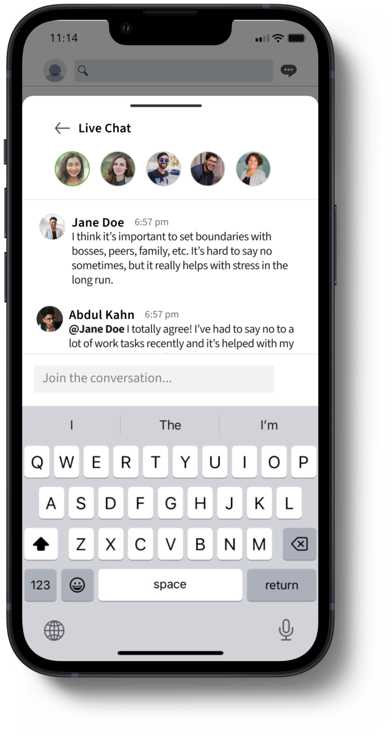
Live Convos:
Users can participate in or host live convos to foster candid conversations


User Feedback:
Include a threshold for the number of people joining live conversations
‘Chat’ might be a confusing term since it’s already a live conversation - am I talking or commenting?
Love the live conversation- actually building a relationship instead of a “connection”
Likes the ability to multitask while listening to live, but wonders if it would decrease motivation to actively participate
Messages:
Customizable templates reduce the stress user may feel when interacting with new people.

A


B
A/B Testing
75% of users preferred templates accessible by replacing keyboard
User Feedback:
Would like the ability to categorize templates with different topics
Useful when reaching out to new connections for the first time
Wants to be able to make own templates; seeks more personalization
Final Screens
For Demi, we designed a discover page, reimagined the feed to prioritize notifications, and streamlined notification management.
For Sahil, we introduced the live convos feature, made it easier for him to manage his network, and designed a message templates feature.


Connection Invitations with intention
Start off new relationships with purpose
Establish the intention in value within your invitations
Promote a rich and meaningful relationship from the beginning
Customizable Message Templates
Ideal for students and new grads struggle to break the ice
Aids in anxiety and nervousness that comes with approaching a new connection
Choose from a library or create your own templates to pitch yourself and guide your conversations
Live Convos
Participate in or host live convos to foster candid conversations
No video encourages emphasis on conversation
Limited participant count for focused discussion
Live Convos cont.
Easily identify active speakers in real time
Use prompts to guide the conversation and break the ice
Utilize the chat feature to interact with other listeners
Categorized Content
Easily separate social and network content from personalized feeds.
Reduced clutter and more intentional usage of the platform
Decreased focus on metrics and discourages toxic culture
Discover Page
Learn about topics of interest and meet new people to add to your network
Filter content by topic of interest using customizable tags
Get a personalized experience while still gaining exposure to new information and people
Prioritize Content
Control who’s content you see first in your feed
Never miss content from your mentor, a recruiter at your dream company, or your favorite pages
Easily prioritize and deprioritize connections with a swiping motion
Reflection
The UX design process isn’t linear. After we completed our first round of mid-fis, we realized we were losing sight of our insights and user needs. We decided to revisit our research and brainstorm new ideas. While it felt risky at first given how far we were in the traditional steps of the UX design process, the outcome was better and innovative ideas that led to a more user-centric product.
Your users are key members of the UX design team. User interviews and user testing is imperative to making good design decisions. We showed our designs to over 50 users and conducted multiple rounds of testing throughout every stage of the process. This allowed us to stay grounded in the needs of our users, ensuring we were always on the same page.
Know when to take creative liberties when using a design system. With my first UX project being a redesign, I was thrown in the ring in learning how to balance my creativity while following comprehensive guidelines. I was able to detect patterns and mimic visual elements to ensure my work seamlessly integrated onto the platform. I learned how to defend my design decisions by citing key elements.
This was my first UX case study. I’m so grateful to have worked with such a talented and tenacious team. I learned a lot over these 10 weeks, but here are my biggest takeaways: